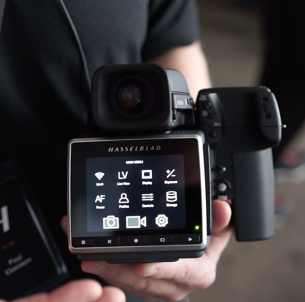
Paul Claesson, Hasselblad Senior Technical Manager, takes me through the user interface on Hassy's just-announced H6D. Lesson number 1: crib from the best.
Hasselblad CEO Perry Oosting told me flat out that Hasselblad's inspiration for their brand new interface on the H6D was smartphones. Yes, you read that right: their goal was to make a $30,000+ camera as easy to navigate as an iPhone.
Smart: it is the best software camera interface I've seen on a dedicated camera, full stop.
Isn't it about time the mass market manufacturers got on board, too?
Of course, the screens on all full-frame, APS-C and MFT cameras are much smaller than the one on Hasselblad's new H6D, and the relatively small size of those camera bodies is a virtue. But this makes it even more obvious that the solution for those cameras is to build smart phone apps that are robust and powerful enough to supplant the functions currently crammed into small camera bodies and screens that would simply be better on a smart device.
Time to allow form to follow function, and deliver everything that a smartphone can do in a user experience.
Then again, if furniture and architecture are any indication, it's no wonder that the Scandinavians are predisposed to embrace this kind of design -- even if its lineage can be traced directly not from Scandinavia but Cupertino, California.

